Collaborative Projects 2
“Alone we can do so little; together we can do so much” ― Helen Keller
Category Archives: Project One
references
Williams, A. (2013, 26 June). The hanging gardens of Dusseldorf: 80ft art installation creates giant human ‘spiderweb’ with 2500-square metres of mesh. Daily Mail. Retrieved from http://tinyurl.com/lsgmw7c
Jobson, C. ( 2014, 7 February). Giant Inflatable Balloons Transform Interior Spaces into Otherwordly Environments. Christopher Jobson. Retrieved from http://tinyurl.com/k8ht7cv
Andrade, J. (2014, 1 July). Geometric floor: Jim Lambie facilities. Ideafixa. Retrieved from http://www.ideafixa.com/chao-geometrico-as-instalacoes-de-jim-lambie/
Martine. (2014, 30 January). Expo Typorama #Paris. Lover of Mint. Retrieved from http://loversofmint.blogspot.co.nz/2014_01_01_archive.html
Freshome. (n.d). 15 Hottest Bathroom Trends of 2014. Rakuten.com. Retrieved form http://www.rakuten.com/essential/post/15-hottest-fresh-bathroom-trends-in-2014
Serie Architects. (2011). The Monsoon Club Ceiling. Trend Hunter Inc. 2014. Retrieved from http://www.trendhunter.com/trends/the-monsoon-club-ceiling#!/photos/134263/3
Murdoch, T.M. (2011, 1 August). Untitled. The Beautiful Soup. Retrieved from http://thebeautifulsoup.com/tagged/desk
Lai, J. (2005, 17 March). Art installation of umbrellas. Flickr. Retrieved from http://www.flickr.com/photos/jikon/31589924
Lecarolimited. (2011). Sharp Mirrored Interiors. Trend Hunter Inc. 2014. Retrieved from http://tinyurl.com/me7thkt
Hendrickson, A. (2009). I‘d like to know. Aesthetic Outburst. Retrieved from http://tinyurl.com/l82suls
Chin, A. (2011, 24 August). Nendo. Design Boom. Retrieved from http://tinyurl.com/kyenr4h
Three. (2013, 13 June). Eat Me. Junkculture. Retrieved from http://tinyurl.com/k67efqz
Tilt. (n.d). Panic Room. HomeDSGN. Retrieved from http://www.homedsgn.com/2012/03/01/panic-room-by-french-artist-tilt/
C-Monster. (2006, 30 November). 11 Spring. Flickr. Retrieved from http://www.flickr.com/photos/arte/311177352/
Silveria, R. (n.d). Depth. Webist Media. Retrieved from http://tinyurl.com/6p73u7k
Straumanis, K. (2014, 4 March). Stuff Being Thrown at My Head: A Series of Whimsical Self Portraits. Junkculture. Retrieved from http://tinyurl.com/pdy7moe
Straumanis, K. (2014, 23 June). Hilariously Twisted Photos Depict People in the Moment After a Fall. Junkculture. Retrieved from http://tinyurl.com/lffvul5
. (2012, 3 May). Graphic design inspiration. From up North. Retrieved from http://www.fromupnorth.com/graphic-design-inspiration-444/
Liu, B. (2011). The Mending Project. Tumblr. Retrieved from http://tinyurl.com/lx3t849
Bean, K. (2014, 2 July). Forbidden Fruit. Design Boom. Retrieved from http://tinyurl.com/n2w4gk9
Displaying Posters in F Block
Today we trimmed all our posters and started the displaying process of the posters. Earlier on we had talked abut how we might want to present our posters and decided that we would like to display them in a circle or pentagon shape. We wanted to have them hanging rather than mounted to the wall as well.
We decided that having a pentagon shape hanging from the ceiling would be the easiest and then from that shape have the posters hanging off each side. We ended up using some wire stuff that Donna had a big roll of to bend into a pentagon shape and then tying on wood to the metal for extra support and it was quite flimsy with out it. We also spray painted it black to give it a nicer finish.
We had some troubles with suspending it to the ceiling as it wasn’t hanging flat. We ended up using some string and tying each side to a piller to help suspend it.
Here are a couple of photos of what we managed to do.
We added the extra string that was to hang off the pentagon shape and have clips attached that then held the posters. When we did a test if this, they just weren’t staying level and were all over the place.
In the end we decided to just put a piece of string across one of the walls in F Block and hang the posters from that using the clips we already had.
Final Posters
Here are our final 5 posters in digital form. We spent today printing them which was a mission in itself. We need to re print Billy’s poster as it came out a lot smaller than it should have. Next class we are going to start installing them in F block.
Putting the posters together
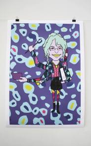
After talking about adding more bold colour and patterns to the posters here is what we now have for each poster. We all agree they look so much better. We have also decided that for the finals we are going to print the images with a white border around them just to break the poster up abit.
Posters my me:
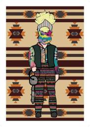
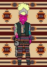
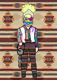
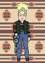
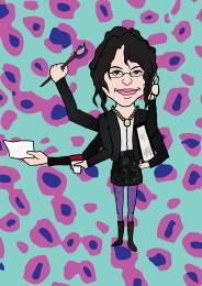
I have been focusing on Donna. I tried a number of different ideas with her. Using the Indian style background made by Elle and also paint splatters. I tried putting the two together as well to see what that would look like. I decided instead of her having denim pants I should find a crazy pattern to replace the denim. What I liked about Elzo Durt’s posters is that he uses bright colours for his characters skin so I experimented with this on the image of Donna. The paint splatters weren’t really working for me. I think they look to tacky. So as a compromise I have painted different colours on her face to suggest the idea of paint splatters. The last image is of Jon I had a go at adding some more colour to his poster but still keeping it flat and ‘sketch’ like to suggest the idea of a ‘building’ plan. It’s looking a little more like pop art with the background I have done. I have also added in some wood texture.
Posters by Chloe:
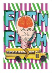
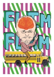
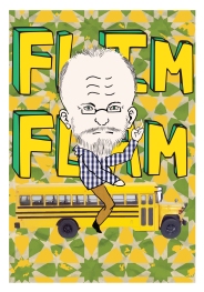
Peter has had an addition of a brain added to his illustration. Just to add abit more colour and humour to his poster. Chloe has also changed up the colours abit to help make the drawing stand out abit more from the background. I am really liking the first one.
Posters by Elle:
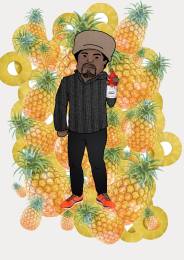
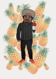
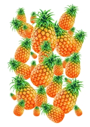
Billy’s poster was by far the most frustrating to make. Elle found some really awesome patterns to use but they were either to small/ or low in resolution or the colours were all to similar to everything else on the poster. Both Elle and I must have tried about 15 different patterns before we were both finally happy. We decided to try changing the colour of the pineapples too because this is something Elzo Durt would do. So Elle inverted them to get them blue and purple coloured.
Posters by Ebony:
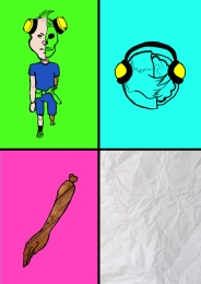
Ebony has been working on Jon’s poster. There has be a lot more texture added to his poster and abit more colour.
Putting the posters together: Reflection
Today we met up after class to show what we had each come up with. The posters weren’t really doing it for us. Elle mentioned that she was thinking we needed to make them a little more crazy and like the researched examples we found right at the beginning. We went back and had a look at the artist model Elzo Durt who we really liked at the beginning and after looking at some of his posters (examples shown below) we decided we needed to add a lot more colour and crazy patterns. We don’t mind if people can’t make out who the people are on our posters thats all part of it. We are now going to go back and add more bold colours and patterns to them. We still want to keep Jon reasonably plain and we still want each poster to describe each person but adding patterns and bold colours is now going to ask the question, is this how these people really are? and do they contribute to F block as a transformative space in this way?
Elzo Durt:
Putting the Posters together
Today we each took a copy of the backgrounds one another had done and each picked a person that we would focus on, to start working with on the computer. We agreed that we would use textures for the clothing rather than just filling the drawings in with a flat colour in photoshop. Some of us did more than one person but we all had atleast one person that was going to be our main focus. Here is what each of us have come up with so far.
Posters by me:
Posters by Elle:
Poster by Chloe:
Background designs for Peter
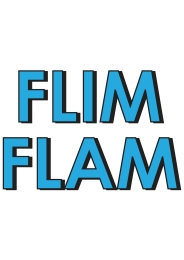
We really wanted to use the quote “flim flam” somewhere on Peters poster so we have decided that it would look good as a background. Here is what we have come up with. These backgrounds mostly explore different type faces and then once we put the drawing on top we will consider colour more.
Backgrounds by me:
Backgrounds by Chloe:
After showing the backgrounds that we came up with. We decided that Peter could do with some pattern behind him maybe too.


